Welcome to the new Ibis!
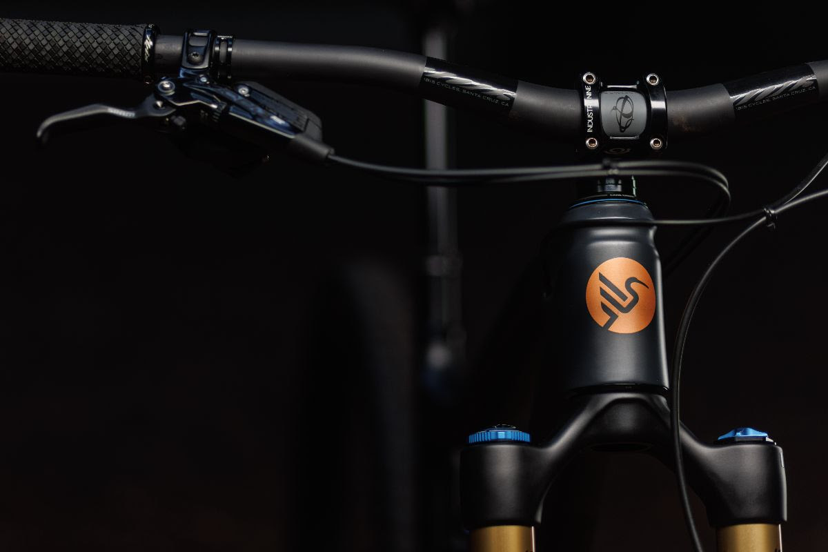
On September 27th, Ibis won a radically different look. Introducing a new logo, word mark, color palette, and typeface that shines a spotlight on the values of the brand.
When founder Scot Nicol was naming his newly hatched bicycle company in 1981, he decided to evoke the thrill of flight by choosing a bird. He liked that birds are light and can fly, which are both positive traits to associate with a bicycle. Strong, elegant, and fast, our new identity instantly evokes the connection between the bird and the brand.
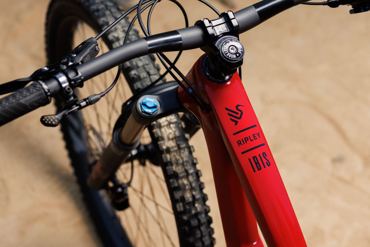
By embracing the bird, Ibis is strengthening the connection between the brand and its core values for a new generation of enthusiasts. Their iconic oval was created in 1993. That was a different time in the bike world and the world in general. Ibis didn’t yet have a website (that came in 1997) and the tubes on the bikes were round, skinny, and made of Moron (more on the end) steel.
Ibis new visual identity pays homage to that hand-crafted past, while looking forward. The new Ibis bird projects strength as it takes flight, while the arced beak is reminiscent of the care we take with the surfaces in its designs.
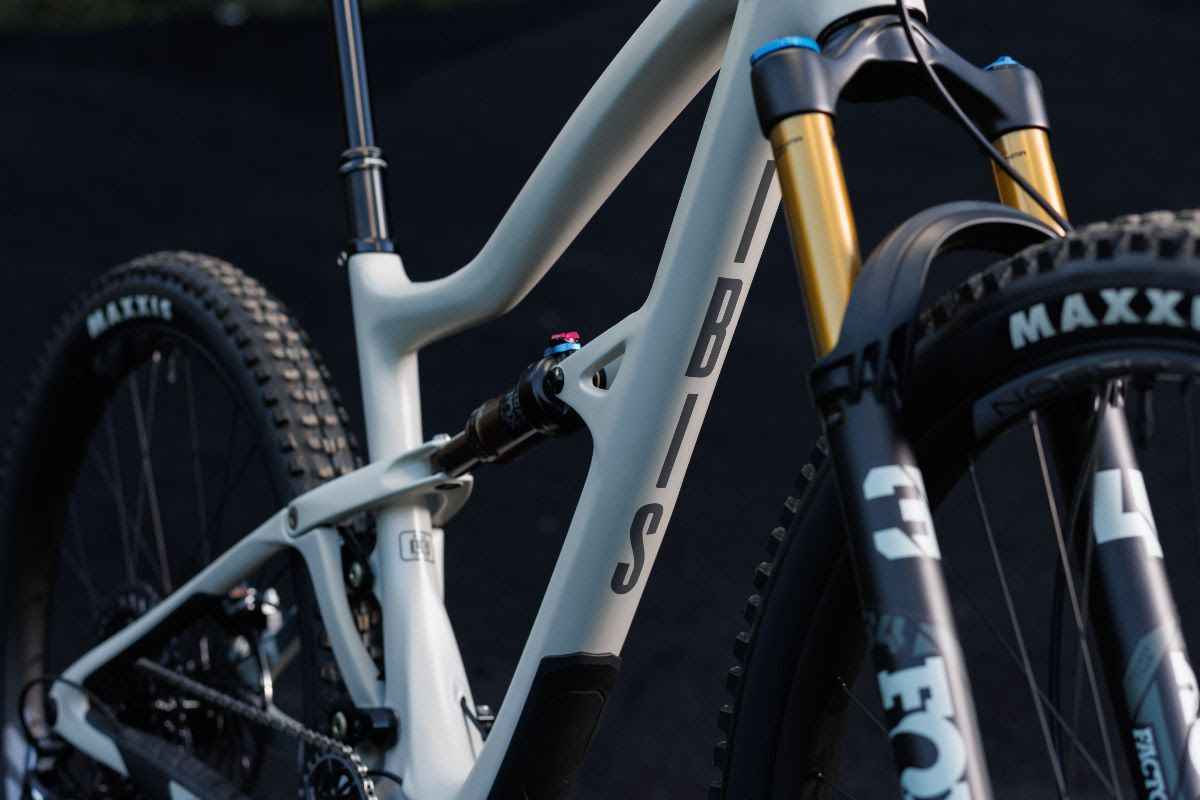
The brand also implemented an uppercase IBIS to remind people visually that the company is no longer the soft “i” of interesting, but a proud and strong “I” that embodies the spirit of us as humans. These visuals are better adapted to the complex surfacing of the frames. They look stable and modern, like the bikes.
Since Ibis’ humble beginnings, this blend of craft, elegance, and irreverence has been a mainstay of the Ibis ethos. The new brand identity reflects this past, while welcoming a whole new era of riders to the flock.